Mobile Website Optimization: 9 Ways to Optimize Your Mobile Site Today
When it comes to mobile website optimization, without knowing what to test or what to do to drive uplift, it can be meaningless. Many times marketers either pass on optimizing the mobile experience completely due to time considerations, lack of knowledge on how to optimize or lack of resources, some simply test for the sake of testing, gaining no insight or knowledge on what truly converts and drives their mobile visitors.
When faced with a leak in the funnel, many marketers look for their answers in a best practices article found on the first page of Google results. Unfortunately in terms of gaining real uplifts and optimizing a funnel for more conversions and customer engagement, that “5 Tactics to Convert More Mobile Visitors by 4000%” article isn’t a one-size-fits-all solution or relevant in any way to your target audience.
Rather than trying what works best for the author of those best practices article, you should run A/B tests that will deliver meaningful and relevant results for your target audience.
To help you get started with better mobile website optimization we’ve compiled a list of everything we’ve learned from running thousands of tests on mobile sites using Banana Splash. Below is a list of some meaningful and effective ways to optimize your mobile website using Banana Splash:
5 Best Practices for Optimizing your Mobile Site Using Banana Splash:
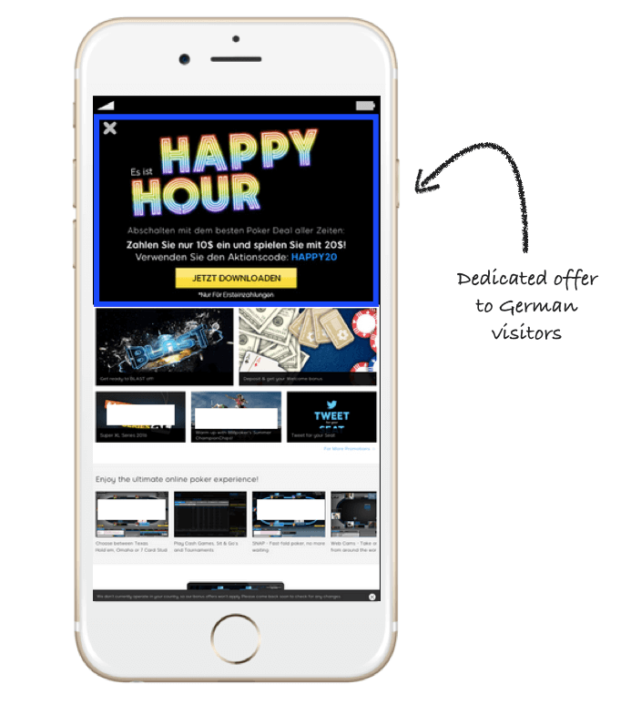
- Target Geolocation – Create splashes based on where your target audience is located around the world. This tactic has proved time and time again to immediately increase conversion rates for our customers. For example, create dedicated splashes in Spanish for your South American customers with relevant offers for them or in German for those arriving from Germany. A great way optimize even further is to set the splash according to the right timezones.
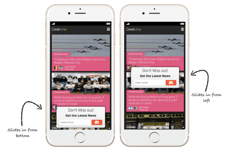
- Test appearance – The placement of a splash on the page can have a huge impact on your conversions. With Banana Splash you can set the splash to appear from the bottom, top or middle of the screen. Each option can have a different effect on the results of your splash. Geektime for example, increased their newsletter subscriptions by 204% by simply having their splash appear from the right-hand side of the screen.
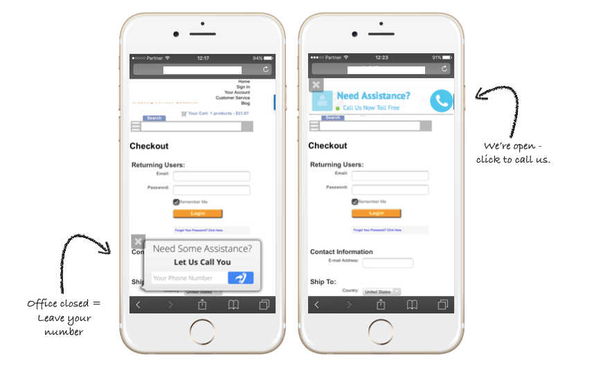
- Time your offers– One of the most frustrating experiences for a customer is calling a business only to find out it’s closed. Create two separate splashes, one that gives people the option to call you during office hours, and another that collects their phone number for a call back once you’re open again. Use the “Scheduler” segment to do so.
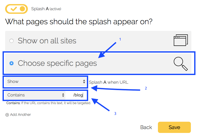
- Segment specific pages – Rather than creating one splash to appear on all pages, create dedicated splashes for your most popular pages on the site with relevant content and calls to action. For example, create one splash to appear on your blog pages and another for your homepage or checkout page.
- Test headlines and call to action copy – It’s the combination of both design and text that make a splash successful. TheNextWeb tested two similar splashes in terms of design with different copy to see what motivates customers and saw outstanding results. More clicks, more signups and more time on site.
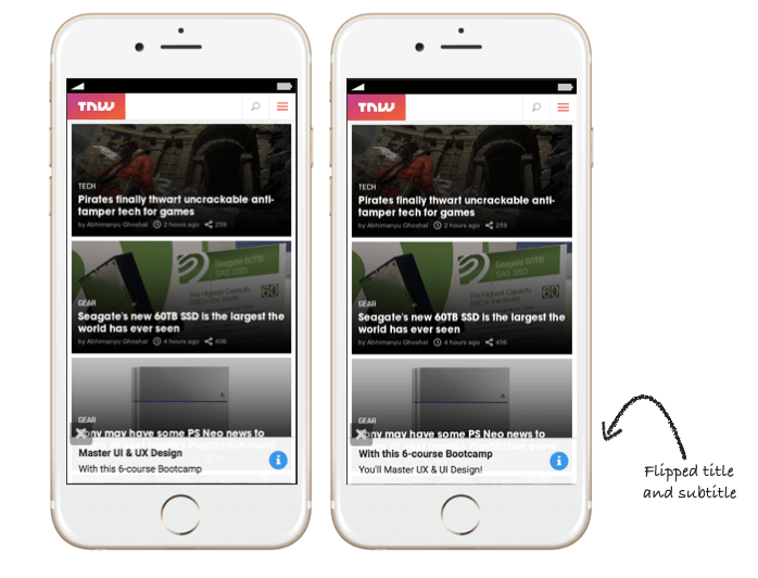
- Test two different designs – See which colors and images work best on your audience by creating two splashes using the same text yet two different designs. The site below saw a 46% increase in conversions for the variation on the right.
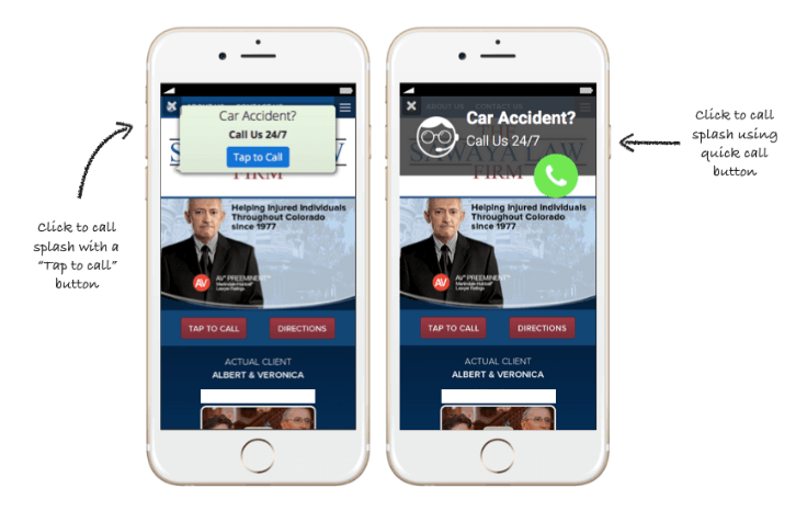
4 Mobile AB tests to run with Banana Splash Advanced Features
Once you’ve upgraded to the advanced Banana Splash platform, a wide selection of segmentation becomes available for your use including advanced AB testing capabilities and many more features. Below are some suggestions for tests and segmentation including case studies and best practices:
- Time you splashes – It’s not just what you say, it’s when you say it. One of the most successful segmentations customers use is our “appearance” segmentation. Rather than immediately asking people to download your app or sign up to a newsletter as soon as they land on your site, try triggering the splash after a certain amount of time they have spent on the page or certain amount of scroll, this ensures that those who see the splash are more engaged with your site and interested in it. Note how Digital Marketer set their splash to appear at 700 pixels (approximately 3 thumb scrolls, depending on the device) to suggest an offer and as a results saw an additional 3300 leads in 4 months.

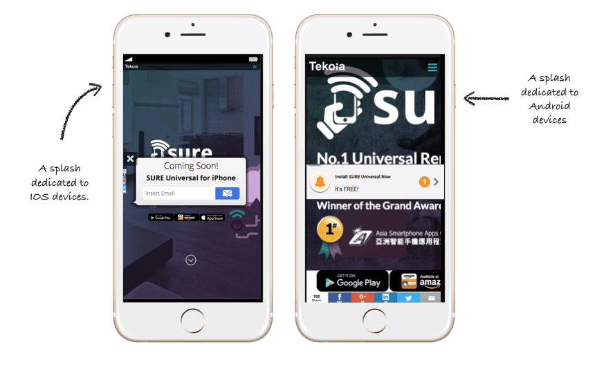
- Segment according to device – As IOS or Android users we’ve grown accustomed to a certain look and feel on our phone. Using the device segmentation you can show visitors a dedicated splash according to their device. For example, Tekoia has a successful Android app, yet they’re still working on their IOS one. To ensure only relevant people get an invite to download the app, they segmented Android users only. IOS users on the other hand receive a splash inviting them to subscribe for updates.
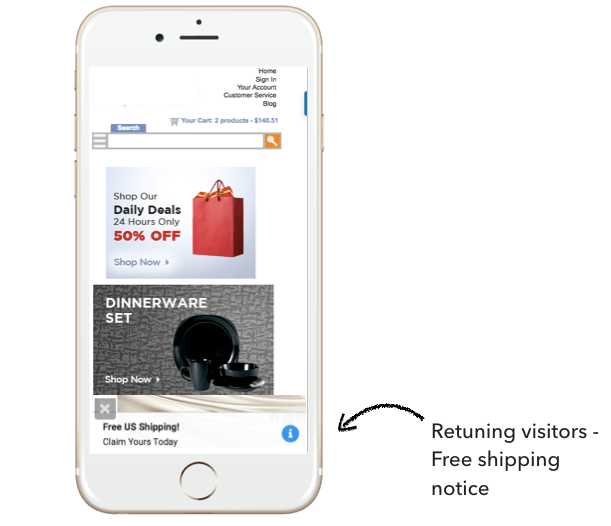
- Address New & Returning Visitors Differently – While some mobile visitors take their first steps within your customer journey, others may have visited your site before and may be more ready to take the next step, this is why different visitors require different experiences, and you can deliver exactly that with Banana Splash. For example, offer a click to call splash for assistance or a whitepaper for a new visitor who may need more information before making a purchase. Then trigger a splash coupon or a “download my app” splash for returning visitor who may need that one last push to make a purchase.
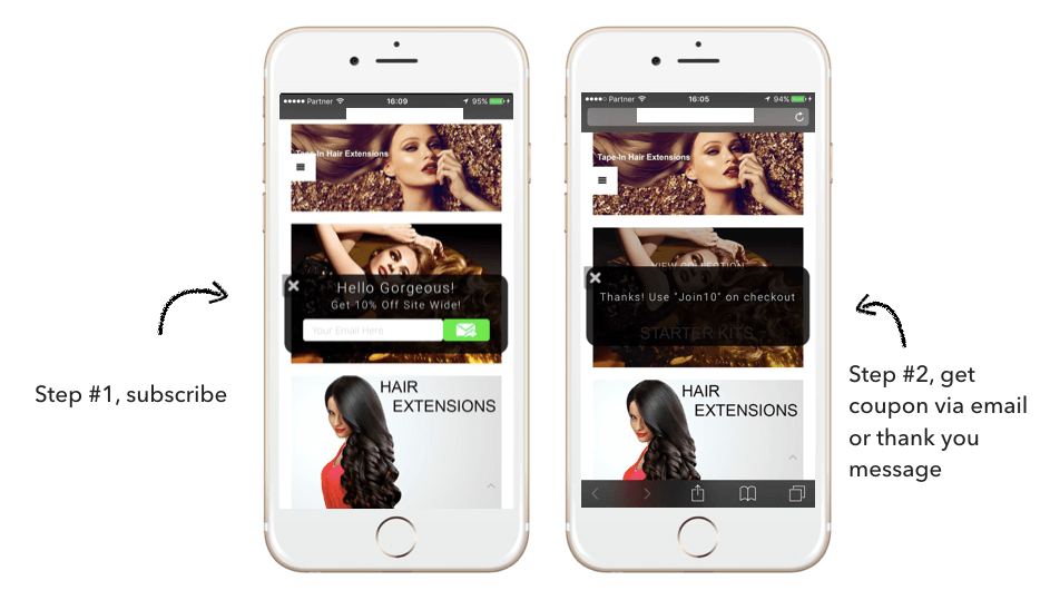
- Offer Coupons – While many people still do not feel comfortable to check out on mobile, a great way to incentivize them to do so is by offering exclusive coupons for mobile checkout. In fact, on average a website using splash coupons sees a 95% increase in mobile revenues.
Over to you
Most importantly, with every interstitial or pop up you create on your mobile site you must make sure it is addresses the visitor’s intent and real time behavior, make sure it’s built for the mobile experience.
Be relevant, mobile friendly and design for a seamless and converting mobile experience. Remember that other than just increasing conversions, our goal is to learn as much as possible about our mobile customers, get to know their behavior and state of mind so we can deliver an experience they actually need, a personal one.


No comments