7 Common Mobile Web Mistakes Most Marketers Make (and how to fix them)
Often times the experience we had in mind, planned and designed for desktop provides a frustrating experience on mobile. Things don’t fit, don’t load or just cannot be found or reached on mobile and this causes huge decrease in page views, customer satisfaction and huge drops in conversion rates. Some of these mobile issues are extremely simple and easy to fix, yet everyone is making them. In fact, there are a few crucial and common mobile web mistakes that keep recurring all over the web that could easily be avoided before even launching an AB test or mobile design if only marketers simply paid attention to details.
In order to avoid these common mobile web mistakes you need to make sure everything works on all devices, this means going through the process of checking your code, design and functionality. This process is also known as QA and is one the most important steps to take before any launch. As opposed to desktop QA, mobile devices are different and require the QA process to be about more than just identifying bugs or critical errors, but also making sure your mobile experience is seamless, simple and one that helps mobile visitors achieve their goals. You’d be surprised how many marketers skip QA on mobile devices entirely or miss out on small yet important details.
There are many different steps to take to ensure your mobile web variation has the least amount of friction and frustration and as a result help mobile visitors take the next step with ease. Below I’ve listed the 7 most common mobile web mistakes we’ve seen thousands of marketers make, and how to avoid or fix them:
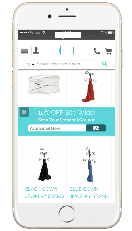
#1 Touch elements are too close
Issue: Not all thumbs and fingers are created equal, some are larger than others and when two links or calls to action are too close to each other it can cause unintentional tapping and navigating to the wrong destination. This is also caused by too much clutter and information on a page.
Fix: Make sure to have enough white space between links and any touch elements.
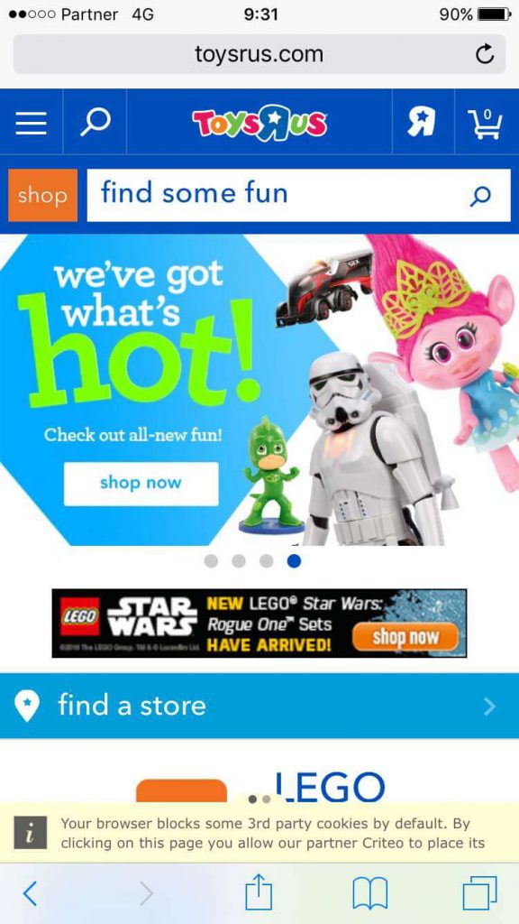
Example: In the site below for example, there are many clickable items with not much space between them:
- The search bar is close to the “shop” button
- The banner below is entirely clickable (which may cause unintentional tapping).
- The main banner contains a slider with 4 different images inviting you to navigate between them. This means that the banner has a double function: tap to choose or tap sideways to change an image.
All of these issues can cause unintentional tapping, navigation to wrong pages and a lot of frustration.
#2 Not adapting keyboards
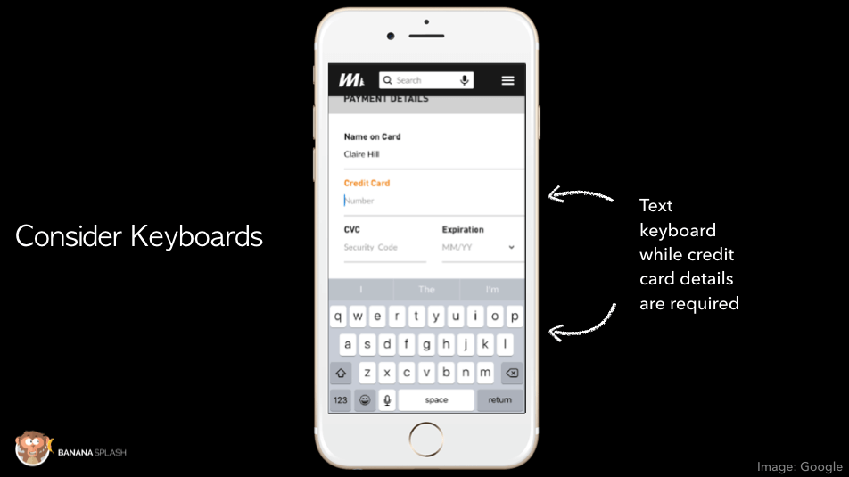
Issue: When mobile visitors are finally ready to convert, it’s our job to ensure a seamless experience. Unfortunately one of the most frustrating things to on mobile is typing and filling in fields and many times marketers and designers making it even harder on us to do so by making us switch between keyboards.
Fix: Make sure the right keyboard appears when people are ready to fill in their details:
- If our goal is to get visitors to fill in their email address and other textual content we must ensure the right keyboard is presented for them to do so (including the @ sign).
- If we want visitors to fill in their credit card number or phone number we must make sure a numeric keyboard is present and visitors do not need to change keyboards and take an additional step before typing it in.
#3 Using Overweight Images
Issue: On mobile, responsive images can take much longer to load, leading to high bounce rate and abandonment rate. People just aren’t going to wait for your images to load.
Fix: Reduce heavyweight images, consider the amount of images you use and optimize for best fit. Remember, you don’t necessarily have to use the same image as on desktop but if you do, make sure they’re adapted in size and weight.
#4 Forgetting Cross-Device Usage
Issue: According to Google, over 65% of all online purchases begin on mobile and continue to other devices. In order to help our mobile visitors, we must make sure they can easily transition to desktop or tablet or we will lose out on sales and conversion rates on all devices.
Fix: Help people transition between devices quickly and easily.
Example: Understanding that people use multiple devices to research and then convert, allowed us to offer a simple way to continue on other devices, enter: the “save for later” splash. Mobile visitors can choose to leave their email address and get a direct link to their inbox with the product to purchase it later when ready (and on any device). This has led to over 54% increase in revenues for our eCommerce customers.

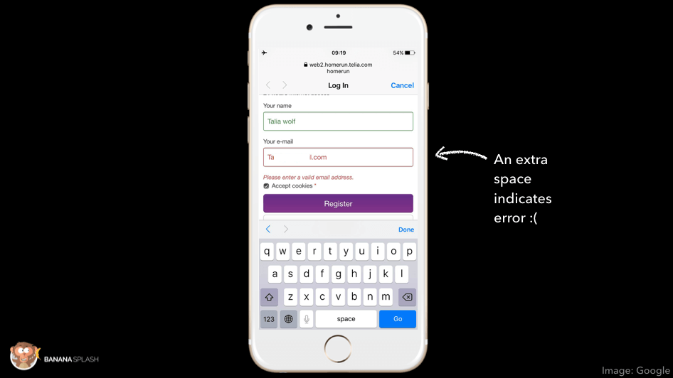
#5 Forgetting Mobile Error Messages
Issue: Error messages play a significant role in helping customers complete an action. In many cases the error message appears as a general note at the top of a page informing you of an error, this causes a lot of frustration.
Fix: Error messages need to be easy to understand in terms of where the error is and what it is. A good way to do this is by highlighting the field with the error and writing an explanation directly below the field.
Example: Note how Intercom highlights the problematic field, but doesn’t explain what the issue actually is. In this case the issue was actually a very common bug that many companies miss: there’s an extra space after the email address causing an error (which isn’t really an error).
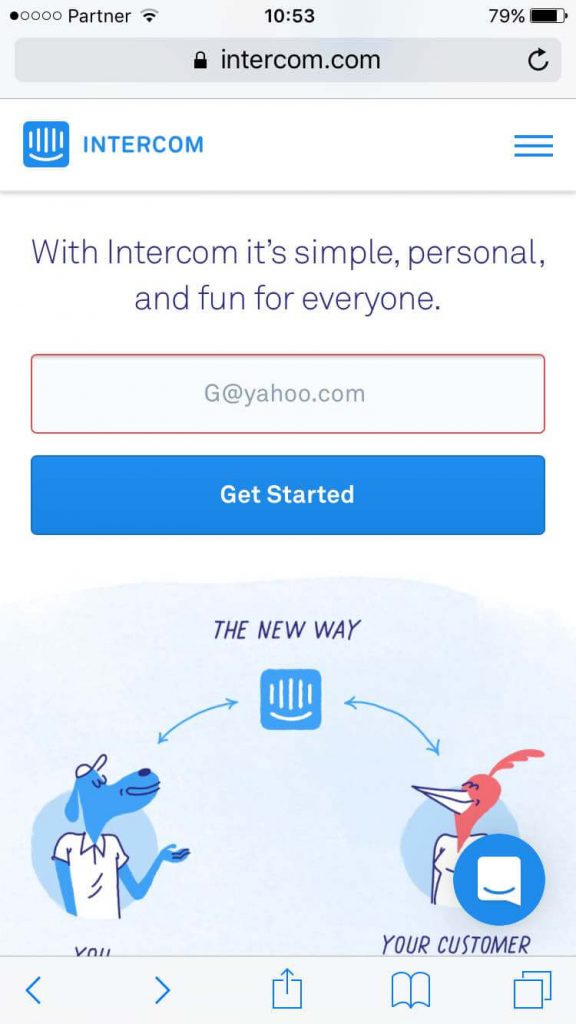
This same exact issue happened to me in Sweden last week, while I was trying to log in to the wifi. I really needed to log in to wifi, so I took the time to figure it out. However in most cases, no one will stay long enough to find out why their correct email is incorrect.
#6 Videos Not Working on Mobile
Issue: Videos are easy to overlook, we simply assume they work well on mobile because they work on the desktop version. However, many companies discover after launching that the video was either unavailable on mobile or sent people out of the site to YouTube once visitor clicked on it.
Examples:
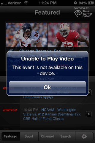
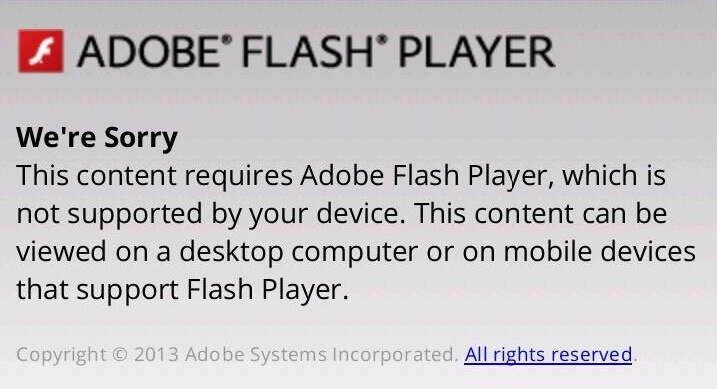
Fix: First make sure to QA on all devices and make sure videos work properly. Make sure they load well on the site, don’t send you to Youtube for example or Vimeo and are easy to close. If your video isn’t enabled on mobile, either remove it from the page on mobile or configure it on YouTube to work for mobile devices too.
#7 Using Harmful Interstitials
Issue: As written extensively in our previous article, Google is about to start punishing mobile websites who abuse interstitials and pop ups. This is something we’re really happy about over here at Banana Splash since we’re seeing more and more companies abuse this tool and create a terrible experience. Interstitials that block content, take over entire screens, are hard to close and hard to fill in are preventing the mobile customer perform the actions they want and are expecting to on your site. This commonly happens because most sites use desktop pop ups on mobile which means they end up looking like this:
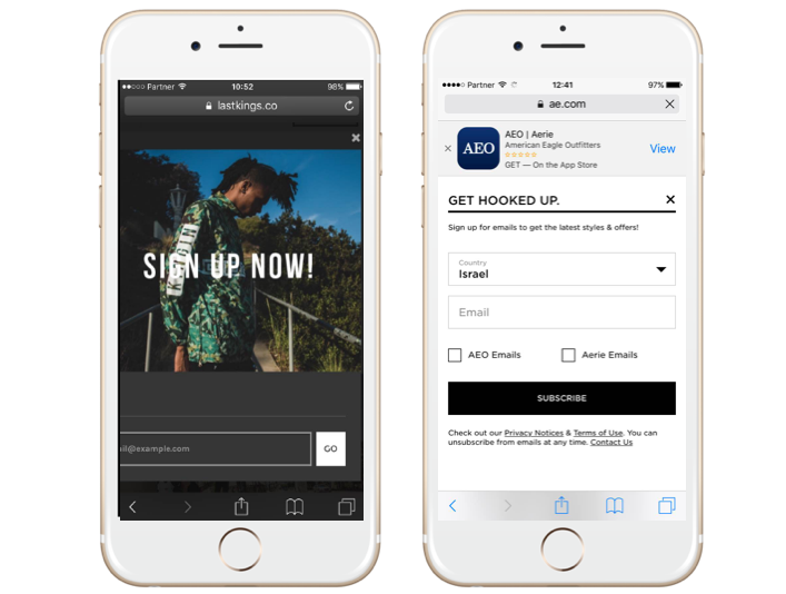
On the left hand side you have a pop up that cannot be completed and on the right-hand side one that completely blokes the site’s content before you’ve had a chance to even check it out.
Fix: Make sure you’re using mobile solutions for your mobile pop ups, like Banana Splash. The key to making these pop ups work (or splashes as we like to call them) is their look and feel and personalization.
- Look and Feel: Make sure your splashes adopt a native look and feel and seem more like notifications than intrusive messages.
- Personalization: It’s not just what you say (or how it looks), it’s when you say it. This is where personalization comes in. Rather than showing an interstitial to a visitor as soon as they arrive on the site, consider timing – when are they most engaged and when would be the best time to show them this message so it doesn’t only serve your goals but actually helps your customers.
Example: In the example below we time the splash to appear only after the visitor has scrolled 3 times on a certain page and has visited the site before, this is how we ensure the visitor who sees the splash is engaged and ready to take that next step and grab that coupon. This specific splash increased revenues for this site by over 200%.
Your next steps
Whether it’s a simple update to an existing page, an AB test launch or complete redesign, don’t assume mobile “is fine” and hit that launch button. To avoid these mobile web mistake, make sure to test on all devices and test everything.
A great way to make you don’t miss out on anything is by asking other people on your team to QA and friends, it’s a great way to see how people who aren’t working on your site and business use the site and what you may have missed.
QA should be part of your natural process in any design and preformed by all team members who are accountable for various things such as copy, development, design and user experience.
Have you experienced any of these mistakes before yourself?


No comments