How to Create Mobile Pop Ups that Google Won’t Punish
It’s been an exciting couple of weeks here at Banana Splash: Google has FINALLY decided to tackle intrusive and irrelevant mobile pop ups and we couldn’t be more happy about it!
Thanks to Google’s mobile-friendly label, over 85 percent of businesses already have responsive sites, however, many mobile visitors are having a hard time finding the content they’re looking for due to intrusive pop ups and interstitials that hide the content entirely. Too many mobile visitors are feeling frustrated and can’t find what they’re looking for.
At Banana Splash we’ve seen this happen time and time again. In fact, a large majority of our customers used to use the same pop up solutions for desktop on their mobile visitors. Why is that in past tense? Because these solutions are built for a desktop experience and as a result, not only look bad on mobile but more importantly block mobile visitors from reaching the content they’re interested in.
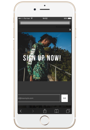
As you can see from the example below, the form field is cut midway (can’t be accessed), it’s hard to reach the “x” button to close the pop up and it’s asking me to “Sign Up Now” before I’ve even had a chance to review the site. This is what most desktop solutions look like on mobile and it is exactly what Google wants to fix.
And, it’s not just what they look like on a mobile screen or even the irrelevant content, it’s their timing too. Most mobile pop ups (desktop too for that matter) treat all visitors the same and show everyone the same pop up with the same message on all the site pages and at all times. Good mobile pop ups are personalized according to search intent, real-time behavior and state of mind. These solutions recognize what mobile visitors are doing on your site, what they’re looking for and give them a clear relevant call to action button.
This is exactly what Banana Splash set out to tackle a few years ago and what Google is about to do starting from January 2017 by punishing websites who provide a poor mobile experience and frustrate visitors.
“Pages that show intrusive interstitials provide a poorer experience to users than other pages where content is immediately accessible. This can be problematic on mobile devices where screens are often smaller. To improve the mobile search experience, after January 10, 2017, pages where content is not easily accessible to a user on the transition from the mobile search results may not rank as highly.”
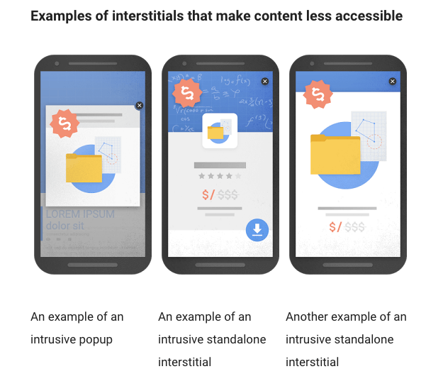
Google’s new policy is ensuring websites treat their mobile visitors can easily access content on their mobile device and gives us clear examples of what you refrain from doing. For example, using desktop solutions which completely overtake the mobile screen and completely block the content a visitor was looking for:
Over the past few years we’ve found that these kind of mobile pop ups and interstitials decrease conversions dramatically. This is why Banana Splash’s solution was built with only the mobile web experience in mind; all pop ups (or as we like to call them: splashes) are designed and configured to work well on over 19,000 different screen resolutions. The splashes are small in size (best fit to read on mobile) and are designed with a native look and feel (similar to a notification) that increases trust and ensures a seamless mobile experience.
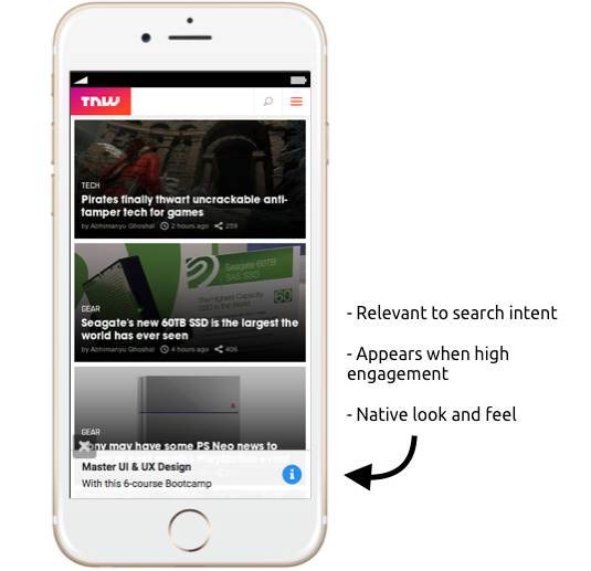
In the example below, TheNextWeb uses Banana Splash to trigger splashes according to content. Each visitor gets a relevant offer according to the content they’re reading and their search intent. In this example, people who read about UI&UX or search for it on Google receive a splash inviting them to dedicated UI&UX course. The splash only appears when engagement is high (after scrolling 900 pixels) and has a native look and feel imitating a simple notification.
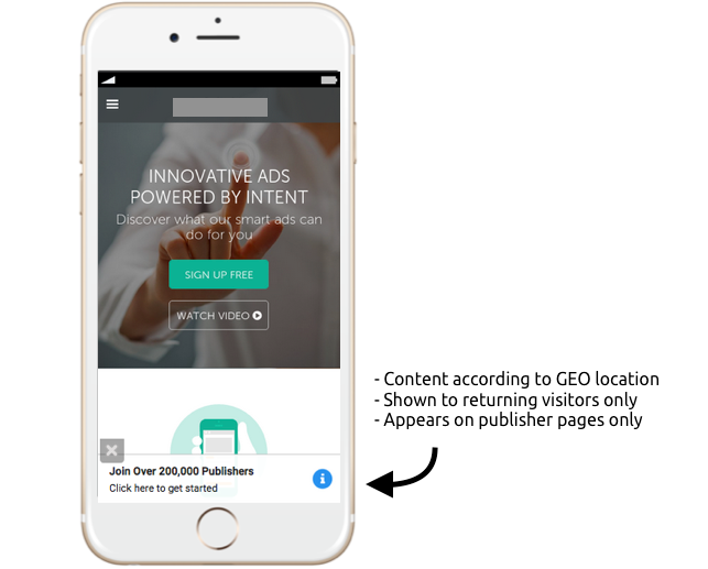
Another example can be seen on the site below. The interstitial only appears on certain pages of the site (to do with publishers), according to search intent and contains different copy according to your geographical location. It is also set to appear to returning visitors only, this way we ensure first timers have a time to look around and get an idea of what the product is about.
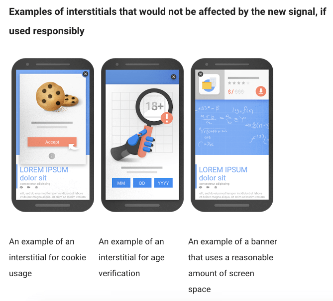
Google goes into greater detail to explain what types of interstitials and pops won’t be punished below:
Lastly, Google reminds us of the most important part of any user experience in general:
“Remember, this new signal is just one of hundreds of signals that are used in ranking. The intent of the search query is still a very strong signal, so a page may still rank highly if it has great, relevant content.”
The most important part of a mobile journey (and any web journey to be exact) is delivering the experience your potential customers are looking for. The more helpful you are and attentive to your mobile visitor’s needs, the more likely you are to convert them.
If you’d like to get additional examples of good mobile pop ups check out this article here.


No comments